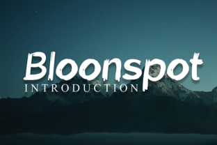
Bloonspot: A Playful Display Font for Digital Branding
As a UI designer who ships landing pages, SaaS dashboards, and e-commerce experiences daily, I pay close attention to how typefaces shape first impressions—and how quickly users decide whether to stay, scroll, or bounce. That’s why Bloonspot stands out in my font library: it’s a hand-brushed display font that balances personality with purpose. It’s not just decorative—it’s intentional. Clean lines meet subtle irregularity, giving it warmth without sacrificing clarity. You’ll notice the gentle taper on strokes, the open counters, and the consistent baseline rhythm—details that matter when rendering at 48px on a hero banner or scaling down to 28px on a mobile CTA.
Bloonspot thrives where digital presence needs expressive energy: hero section headlines, product launch banners, course title cards, and logo lockups for creative studios or boutique brands. Its quirky-yet-polished voice works especially well for audiences that value authenticity—think coaching websites, indie makers’ portfolios, handmade online stores, or wellness apps. Because it’s built as a display font, Bloonspot isn’t meant for body copy. But used right—as a headline, button label, or accent phrase—it lifts visual hierarchy instantly. On a landing page, pairing Bloonspot with a neutral sans serif like Inter or Manrope creates contrast that guides the eye: your value proposition pops, your subhead supports, and your CTA feels inviting—not distracting.
Readability on screen is non-negotiable—and Bloonspot delivers where it counts. At sizes above 24px, its letterforms remain legible even against soft image overlays or gradient backgrounds. For mobile-first layouts, I recommend using it at minimum 32px for headings and never below 20px—even then, only for short, high-impact phrases like “Join Now” or “New Collection.” Avoid placing it over busy textures or low-contrast backgrounds (e.g., light gray text on off-white). Instead, pair it with solid dark or light blocks: charcoal backgrounds make its brush texture sing; clean white space lets its airiness breathe. Test it in your design system across iOS and Android—Bloonspot renders cleanly in modern browsers and holds up well in variable-weight webfont implementations.
What makes Bloonspot more than just another playful script? Its restraint. Unlike many handwritten fonts, it avoids excessive flourishes or unpredictable joins—so it scales predictably from desktop headers to Instagram story graphics. It’s also optimized for digital use: no unintended ligatures, no ambiguous glyphs at small sizes, and no spacing surprises in tight containers. When used for logo text in a brand kit, it conveys approachability without undermining professionalism—ideal for founders who want to feel human, not corporate. I’ve used it for a ceramicist’s online shop banner (“Handmade with Care”), a mindfulness app’s onboarding screen (“Breathe In”), and a newsletter header (“The Weekly Spark”)—each time reinforcing tone before a single word is read.
Font pairing is where Bloonspot shines brightest. As a display font, it demands thoughtful companionship. For web interfaces, I default to geometric or neo-grotesque sans serifs—Inter, Poppins, or Work Sans—for all interface text, navigation, and body copy. Their neutrality lets Bloonspot lead without competing. For editorial-style digital products (think blogs or course dashboards), a warm serif like Lora or Cormorant Garamond adds sophistication while keeping contrast intact. Never pair Bloonspot with another decorative or script font—it dilutes focus and muddies hierarchy. And avoid stacking multiple weights of Bloonspot itself unless the family includes true optical sizing; most display fonts don’t, so stick to one weight for consistency.
Before deploying Bloonspot in production, verify file formats and licensing. It’s available as WOFF2 and WOFF for fast web delivery, and includes OpenType features like standard ligatures and stylistic alternates—useful for fine-tuning logo variations or avoiding repetitive glyph patterns in headlines. Check multilingual support if your audience spans regions beyond English; Bloonspot covers Latin-based languages well, including accents for French, Spanish, and German. Crucially, confirm commercial licensing covers your use case: embedding in client websites, SaaS platforms, Shopify themes, digital templates, or branded email campaigns. Most premium font licenses allow this—but always review the EULA, especially for hosted services or white-labeled products.
In practice, Bloonspot performs best when applied sparingly and deliberately. Use it for:
- Primary headlines in hero sections (max 6–8 words)
- Logo text or wordmarks in brand kits
- CTA buttons on conversion-focused landing pages
- Section dividers or feature highlights in portfolio sites
- Overlay text on social media banners and digital ads
Ultimately, Bloonspot isn’t about trend-chasing—it’s about choosing a typeface that aligns with how your brand speaks, moves, and connects in digital space. It supports trust through consistency, engagement through contrast, and memorability through personality. When every pixel serves intention, even a brush-stroked “B” becomes part of your UX strategy.